Design Tips for Creating a Successful Logo
What makes a good logo? Think about some of the most popular logos such as Nike, Adidas, Pepsi, McDonalds, Taco Bell and so on. What makes them grab our attention and easy to remember?
They are all simple and catchy and this makes it easy to store them in our memory. While simple and catchy is the key to creating a logo it is also essential that a logo conveys a message about the spirit and quality of the product or company that it represents. This is reinforced not only through the performance of the product/company but also through marketing and advertising. Because a logo communicates a great deal about a product, service or organization, they can make or break a company's brand. Image is everything so keep this in mind when designing your logo.
Use the following guidelines to help guide you through the creation of your logo:
Keep it Simple
There is a common Design Principle acronym, KISS, that stands for "Keep It Simple Stupid". We are constantly busy and have very little time to focus our attention on marketing materials. An overly complicated design will most likely be overlooked. Simple doesn't require as much effort to understand it. It catches our attention quickly and our brains make the connection for us. You might have an extremely clever concept full of symbolism but chances are the majority of viewers will never take the time to appreciate it. Compare it to this analogy: A clean and simple room is much more inviting then a messy cluttered one.
Make it Memorable
Creating a unique logo while still keeping it simple is the key to making it memorable. Humor can also be used to create the unexpected and make your logo stand out.
Ultimately, the only mandate in the design of logos, it seems, is that they be distinctive, memorable, and clear.
— Paul Rand

Make it Bold
If you are looking at something quickly, or while in motion, a bold logo with strong contrast will stand out over a fine, dainty one. An elegant, fine lined graphic may be striking but those delicate lines are difficult to see from a distance or when sized down. Whereas, a logo with bold fonts, lines and shapes will remain distinguishable.
Make it Legible
Have you ever noticed what some iconic logos including Nike, Pepsi, Adidas & McDonalds have in common? Besides following tips 1-3 (Simple, Memorable & Bold) they all use a bold sans-serif font (a font without feet like Arial or Helvetica). The fonts might seem so similar to each other that they appear unoriginal or boring but the reality is they stand out and are easy to read no matter how small they are sized down. While you can still have an amazing logo without using a sans-serif font be sure that whatever font you choose can be read clearly and quickly.
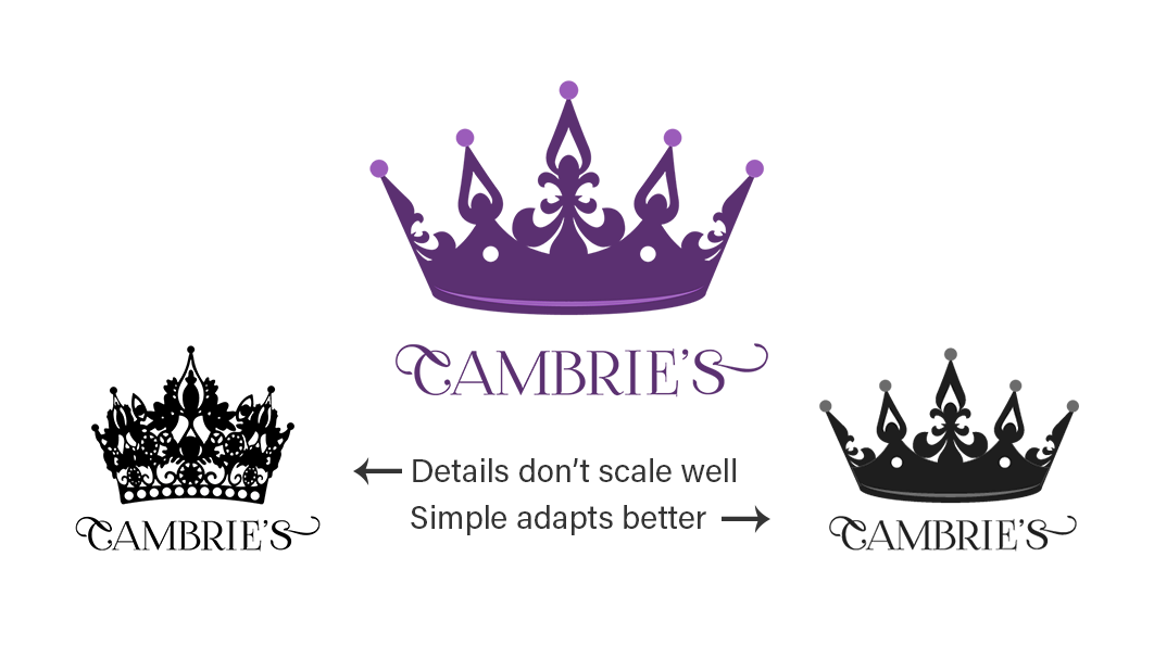
Make it Versatile
A logo needs to look good in all sizes; think billboard to business card size. If your logo has a lot of detail it may become lost when reduced. Logos should be created as a vector graphic (.ai, .eps, .pdf) so that they can be enlarged or reduced without losing quality. A versatile logo also needs to stand on it's own without color and also look good when inverted (colors are reversed). Creating your logo first in black and white allows you to focus on the concept and design and gives you a low cost printing option. Once your logo is finalized then it's ready to add color.
Design to your Audience
Sometimes it's easy to design to our own likes and taste, however it's important that your logo is suitable for your product and audience. Fonts have personalities and colors can be used to create emotions. A fun playful font with bright primary colors would be appropriate for a logo that caters to children but would not be suitable for a law firm. Decide first how you want your company to be perceived and then design accordingly.
